If you follow me on Instagram, you may have seen my photo on Monday:
That day, I received a sample of Trustworth Studios' "Apothocary's Garden" wallpaper I had ordered. I decided immediately it will be used and couldn't wait to share it with my Instagram friends. Thankfully, you all agreed that the paper was as fantastic as I had thought (Adam did too! Yippee!).
The arrival of the paper got my mental wheels turning, so now I'm scheming some changes in the half bathroom. Let me tell you about them...
A few of you (including Mom) commented that the wallpaper paired well with the existing gray tile in the half bath. I must admit, I first wanted to tear those tiles out and never look back. But, after considering your perspectives and talking to my father-in-law about the work involved with tile removal, I'm coming around to the paper-tile combo.
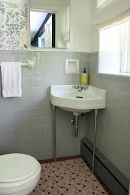
Here's how the bath looks now:
Even the faucet has a sad face over the bathroom's current appearance.
It's a tiny space, with a footprint that's just 4.5' x 3.5', but the room is right off of our den. It has already proven to be the bathroom we use most often. And because it's used more than any other, it deserves to pack a punch. Good things come in small packages, after all.
I determined to keep the toilet, original corner sink and the medicine cabinet--a good way to honor our home's character and keep the cost down. I do, however, want to change the floor.
This is the direction I'd like to go in:
As you can see, the major changes consist of hanging wallpaper and replacing the mismatched burgundy floor tile with penny round tile in white. The toilet seat will be replaced with a classier black option and the cotton voile cafe curtains will offer privacy without blocking light from the small bathroom window.
I'm not sure when this change will actually go down. Maybe soon, maybe not so soon...either way, I'm inspired and can't wait to get my hands dirty spiffing up the space!


Love it! I would love to see the black tied in to the floor with those classic hex tiles that are white with either black "dots" or black flowers. But I do love the clean look of all white penny, too. That wallpaper rocks.
ReplyDeleteHeather
loveyourspace.blogspot.com
Where can you order that paper? I am also in Suburban Philadelphia (on the PA side) and have that same tile... I've painted the bathroom three times and have hated every color I've choosen. For some reason the gray is hard to match. I LOVE this wallpaper with the tile. Thanks!
ReplyDeleteOooh I would love a black toilet seat!
ReplyDeleteChampagne Lifestyle on a Beer Budget
First of all, I love that paper! I find that you appreciate the more obscure classics (such as a little Arts & Craft nod) and I like that about you, Ashley. :)
ReplyDeleteSecond, Imma be laughing about that sad-face lavatory for a good while.
I love it Ashley! The paper is so sweet and I love it with the gray tile too!
ReplyDeleteI love your plan. I think you are spot on, once the floor is changed and you've got that wallpaper the tile on the wall will look purposeful and gorgeous! Love it!
ReplyDeleteI love all of your ideas! I think it is going to look great!
ReplyDeleteThe paper is so pretty and is going to make all the difference! I already love seeing just that little patch of it on the wall.
ReplyDeleteGorgeous paper and terrific choices! Looking forward to seeing the progress - and the finished product.
ReplyDeleteAwesome finds! Your wallpaper went well with your bathroom. It really lit up the space! I think it would be fun to take a bath if that's what you're gonna see.
ReplyDelete