Pages

Wednesday, August 31, 2011

High vs. Low: New Framed Artwork 'round the Apartment

Just last night, I picked up my Bella Foster "Still Life with Flowers & Moth" from my new favorite frame shop and I couldn't wait to share it with you all. Isn't it fab?
The print was a very special bridal shower gift from my cousin and, as such, it seemed appropriate to spring for a quality custom framing job rather than a less expensive frame from Michael's or AC Moore.
Here it hangs in our hallway, nestled among our custom Carter Kustara silhouettes.
I don't often choose the "high"/expensive option over the bargain, but here I did and I think Ms. Foster would be pleased. 
Now for the "low":
In the name of memories, I framed some remaining vintage stamps that I bought to use on my wedding invitations (for more on the stamps, see here). They were too special and pretty to be relegated to a box or drawer, wouldn't you agree?
Now they hang in the den and remind me of our wedding everytime I pass by.
The frame and matting were purchased in pre-Irene haste (I needed a project or two to carry me through the storm) from AC Moore and I spent some time spray painting both (yes, even the matting) over the weekend. The stamps were adhered to off-white cardstock using this fabulous no-wrinkle glue. All told, this low-expense framing cost about $11. 

High vs. low, as we all know, is a delicate balance.
I'm definitely pleased with the framing choices I've made.
How do you decide when to splurge and when to save on framing your artwork?

Monday, August 29, 2011

A Whole House Transformation in Country Living

I hope everyone reading this somewhere on the East Coast is safe after this weekend's hurricane...and what's a better diversion than a pretty house transformation? I offer up this whole-house renovation, which appears in the latest issue of Country Living.

Lisa Story's Connecticut home received a thorough and serene renovation thanks to her interior designer sister, Sara Story. Each room, which you'll see below, projects a refined casual feel that I'm really responding to...perhaps it's the subtle color choices and interesting fabrics throughout the home:
(via Country Living)
Everything feels subtle and perfectly considered in this home.
While a whole-house transformation seems costly and unlikely for many of us, there is an attainable aspect of this renovation. Country Living, I think, does a good job at highlighting homes that really manage to balance high-and-low in a way that other shelter magazines forget. The rooms in Story's home are composed of high-end fabrics as well as less exclusive catalog and tag sale finds.
Bravo, Country Living!

Friday, August 26, 2011

Meet Me in Philadelphia in the Philly City Paper!

About two weeks ago, I alluded to some very exciting things around the blog but now I'm ready to reveal those happenings: 
 Our apartment, and Meet Me in Philadelphia, is currently being highlighted in this week's Philadelphia City Paper (in print; on page 24) as well as on their "The Great Indoors" blog today. Back in June, the delightful Meg Augustin of the City Paper contacted me about a feature and I've felt flattered, honored, humbled and grateful for the opportunity ever since.

If you have a few minutes today, I'd love for you to check out the article and slideshow of photos here (P.S. more pictures should be up shortly!)...or, if you're in the Philadelphia area, pick up a copy of this week's City Paper and check out my apartment inside on page 24!

Happy Friday, everyone. Hope you all are hurricane-ready!

Wednesday, August 24, 2011

New Marblelous Elements Around the Apartment

Monday's post focused on the trending of all things marbleized and marble-printed. I had two to-dos in the works this week that were inspired by this trend and I'm only getting around to sharing...

Marble-themed Project #1: marbelized cotton fabric table runner
On Saturday, I picked up this green and black printed cotton from Joann Fabrics that resembled hand-marbled paper. In case you missed it, this fabric was on sale for only $6.99! Naturally, I bought all that they had (the remainder of the bolt) and quickly began devising a project for this on-trend fabric.

Why not a runner for my green kitchen? That is just what I set out to make.

I won't bore you with the sewing details (it was really straightforward, and involved little more than me hemming all 3 yards of the fabric around all 4 edges of the fabric). Instead, I'll just direct your attention to the final results, which speak for themselves:
The black kitchen table and chairs needed some color to balance with the green elsewhere in the room, and I think the runner accomplishes just that--a much needed dose of color!
A detailed shot of the fabric:
The print is reading more teal in the photos, but the color is really a rich, multi-toned green. I couldn't be happier to say that I made this marble-print runner myself!


Marble-themed Project #2: marbelized paper drawer liners
The drawers of the grass-green sideboard in my kitchen had been ignored for nearly 7 months before I got around to jazzing them up this week. As a fun departure from standard rolls of scented drawer liners, I thought a few rolls of marbleized bookbinding paper would offer a nice, unique touch.

The before: no muss, no fuss, clearly.
 Each of the four drawers of the sideboard were removed. I set up myself on the floor and used a few pieces of brown kraft paper to fashion templates for the liner of each drawer. Templates are definitely the way to go--they allow you to get the sizing perfect before you start cutting. This way, you won't accidentally waste pretty paper if you misjudge the size of the drawer paper needed.
 After I traced out the liner for each drawer and cut each to fit, the paper was placed in the drawers and secured with double-sided tape. It was that easy! I chose to use tape rather than glue so that I have the option to change out the liners whenever I feel the urge.
 Once each drawer was lined and back in their rightful place, I can continue enjoy this view every time I open them.

The after:
It's the little touches that make all the difference, isn't it?

Based on your comments to Monday's post, I'm dying to see the marble elements that you've recently introduced into your homes...please be sure to share, Kim and Kathy!

Monday, August 22, 2011

Marblelous


Marble patterns and the art of marbleizing papers have seen a resurgence in recent months. Elle Decor recently proclaimed that marbleized products are "back", so I wonder: are you introducing this trend into your home through fabrics or other decorative pieces?

This weekend, I found these cotton marbled printed fabrics from Joann Fabrics for $6.99 a yard and thought these prints could easily pass for a much-more-expensive fabric used for Dransfield & Ross napkins.
(sorry for the crappy phone picture)
I brought the green marbled fabric home with me and, for all of $14, intended to make runner for my kitchen table. Full project details to follow.

Also, these two rolls of grass green marbleized paper have been awaiting a project for months now and I just got around to deciding on their use: chic drawer liners for my green sideboard.
($9 at Dick Blick)
I'll be sure to share the drawer lining project posthaste.

Still interested in more marbleizing?
Want to craft your own marbled fabric? This tutorial is worth checking out.
(via Kristin La Flamme)

Do you have any elements of this trend currently on display in your home?
Any marbleized projects you've recently completed?
If so, do tell!

Friday, August 19, 2011

TGIF, 8/19/11 Edition

There are only a few more weekends left of summer before we all slink back into our usual routines and we start talking about school, pumpkins and sweaters (not that any of those topics are bad in my book). But, before we allow ourselves to be fully absorbed into the autumn season, let's enjoy the final fleeting moments of summertime before they're gone.

Last weekend, Adam and I enjoyed a Saturday in the lovely shore town of Strathmere, New Jersey and I managed to capture a few snapshots of the afternoon. Hope you enjoy them.
(all photos via me)

Wherever you'll be, I wish you a wonderful late summer weekend.

Thursday, August 18, 2011

Sales of the Season


I love a good sale, don't you? It seems like, in this current economic setting, that any piece of home decor that we lust after at full price will soon be discounted if we're willing to wait long enough; am I right?

I'm trying to keep myself from shopping for a little while, but there are so many chic items for the home that are currently discounted. So, if you're itching to score a deal, may I present these goodies for your viewing (and shopping) pleasure:

Roberta Roller Rabbit always has a great selection come sale time:
(18" x 18" Gwen pillow in red from Roberta Roller Rabbit, $29)

This loveseat will one day appear in my house, you can hold me to that:
(French settee with slipcover from Wisteria, $1,259.10)

This gourd lamp from Macy's looks both natural and industrial. I'm loving its metallic finish:
(Silver gourd table lamp from Macys, $153.99)

This garden stool would be equally striking as on a patio as it would be in your living room:
(Column garden seat from Ballard Designs, $99.99)

The beachy-and-boho feel of this lamp strikes the perfect balance:
(Jute table lamp from Terrain, $183.95)

Whoever said window shopping was fun never met me...I hope that you've scored some wonderful sale items recently because there seems to be great sale selection on the interwebs. What deals have you found lately?

Tuesday, August 16, 2011

A Coatrack on the Cheap

Before I move on from the changes I've made to the guest bedroom, I wanted to share a very quick and cheap (always good!) coatrack that I made to add some much-needed organization to the room. I'd previously lusted over pricey coatracks on this blog but I thought my money was better spent elsewhere, so I went ahead and tackled my own using some materials I had lying around the apartment.

For my coatrack, I gathered together 5 off-white ceramic knobs that I bought from Hobby Lobby, some Gorilla glue, and a small piece of wood--the piece I used was cut at Home Depot. For reference, it measures 24" x 2.5" x 1" and it was spray painted using Rustoleum Painter's Touch in Heirloom White (satin finish, btw).  
I've had these knobs on hand for months. I bought them when I was re-doing my grass green sideboard, but decided to use these Martha Stewart knobs instead. Fast forward six months, these $2.99 Hobby Lobby drawer pulls are serving as the basis for a quick and easy project elsewhere!
Construction of the coatrack was simple.
First, I removed all of the screws and washers that came with the knobs for their original purpose, to be actual drawer pulls.
Then, I took time to space each knob equally across the piece of wood before eventually securing each knob with the superglue--no screws or nails needed for this part!
Voila! It's as easy as that. 
Lastly, I added a picture hanger on back of the coatrack and, after waiting a few hours for the glue to fully cure, the rack was ready to be hung. 
The final product:
Quick and easy!

Monday, August 15, 2011

A Marvelous Night for a Moondance

...in the guest bedroom, at least. 
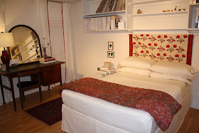
I recently scored a deal on Lulu DK's "Moondance" fabric (in beige background w/red) from One Kings Lane, and put the yardage quickly to work to fashion a simple, chic headboard of the guest bedroom. This project was taken directly from a re-do that the Martha Stewart team cooked up for one of their own editors.

Perhaps you remember this room:
 (via Martha Stewart)

This room from MSL provided a lot of inspiration for my almost-finished guest bedroom. The headboard was a simple panel of printed fabric (here, also Lulu DK's Moondance fabric) hung from an inexpensive and unobtrusive quilt rack--which meant I could easily recreate it without investing a lot of cash or time. For reference, I used this $8 wooden drapery rod and bracket set from Lowe's to hang the "headboard".
For the most part, this room is complete. I'm sure I'll add things here and there, but I can proudly say that the space now reflects a happy and unique aesthetic that any guest would enjoy for a weekend. If you haven't been a reader for very long, you may not remember how this room started. Here are some "before" pictures:
The "before" seems like a million years ago. Reworking this space was a slow and deliberate process that involved many DIYs that saved money and produced a room that I'm genuinely proud of putting together.

Now, who wants to come for a visit?