Pages

Friday, September 28, 2012

New Bright White Lamp

Last week, I stopped by Ikea while Mom was around. I was a woman on a mission while there, because I knew I couldn't leave without taking home the new Tisdag work lamp to add a bit more extra bright white feeling to the top of my entry chest.
I'm sinply crazy about it.

I've been very busy all week continuing projects for my guest bedroom (say goodbye to these ugly shelves!), so I'm looking forward to some time with my husband this weekend.

'Til Monday, dear readers.

Thursday, September 27, 2012

My Cheapo Mirror Gets Gilded

My posts this week have been dedicated to projects accomplished during Mom's visit last week--all of which enhanced my guest bedroom. Today's project didn't happen while Mom was around, but if you ask me it does improve the guest room quite a bit!

I picked up the old rounded mirror (below) from the local Habitat for Humanity Restore for $2 sometime during 2011 for the desk in my guest bedroom. The shape and the worn silvering of the mirror really spoke to me. That kind of age you just can't find on a new piece.

Wednesday, September 26, 2012

Changing Up the Curtains in the Guest Room

In an effort to save myself an bucket of cash, I created a copycat version of the "Toorie" curtains from Anthropologie for our guest bedroom last year. Trimmed in cheery red pompoms, the panels felt very "me" but I had a revelation about my guest bedroom recently--I wanted to remove some of the red accents. 

Gasp! I know, I know. 
Who am I?
I consulted with Mom, who has a great eye, and together we agreed that the addition of 1/4" black bias trim would add a refined look to the simple linen curtains. I also swapped out the white roman shades that hung in the small windows for these bamboo shades from Overstock. The bamboo shades now work with the mottled colors in the large jute rug. 
Notice that large mirror on the desk?
Check back tomorrow to see how it's been gussied up!

Tuesday, September 25, 2012

A Pair of Tasseled Pillows

Ready for another sewing project from the "Week of Mom"?
She and I worked together to create 2 new accent pillows for the bed in my guest room, made from fabric I purchased while in Copenhagen.
After constructing 2 12" x 16" pillows from this fabric, Mom and I added a pair of black and olive yarn tassels to each corner of the pillows. The tassels brought some much-needed contrast to the bed while also tying in black and olive green accents from the Lulu DK fabric headboard.

Tassels are pretty simple to make but, first, here's what I needed to make them:
1) a skein of yarn (I used Lion's Brand acrylic yarn in black and olive)
2) scissors

Want to see how to make a tassel in 5 easy steps?
 Now that the tassels are complete, take the extra yarn at the top of the tassel and use a large embroidery needle to sew it through to the inside corner of the pillow. Knot the extra yarn several times inside the pillow.
And, like that, the project was complete!
The dash of color at each corner make the pillows feel extra special, don't they?
I like that the pattern reminds me of our trip to Denmark and the tassels reminds me of spending time creating things with Mom. Talk about a one-of-a-kind accent.

Monday, September 24, 2012

Newly-Revamped Ticking Stripe Skirted Table

Over a year ago, I crafted a fabric-covered skirted table for my guest room from an affordable neutral twill drop cloth with lots of help from my mom. But, because I'm so darn fickle, I decided the neutral skirt was a bit too neutral. Mom was visiting last week so we decided to tackle 'Project: Skirted Table, Version 2.0'.

Inspired by the fabric-covered bedside table from Ivanka Trump's former apartment, I ordered ticking stripe twill in black/ivory to complement the existing colors in my guest bedroom.
(via Little Green Notebook / ticking stripe fabric via Fabric.com)

Ticking stripe, while a print, reads as a subtle pattern so it doesn't monopolize all the attention in the room. In addition to changing out the fabric, I also added a glass top as a finishing touch. 

With 4 yards of fabric in hand, Mom and I got to work. 
We decided to construct the table skirt from 3 large pieces of fabric: one piece that covered the top, front and back of the table vertically, one piece for the left side of the table and the last piece for the right side of the table. Mom smartly suggested sewing two buttoned tabs to the front of the table as an added detail. This element makes such a difference, doesn't it?
With the skirted table revamped, the piece deserved a prime location in the room. 
Now, it sits directly across from the bed and will get the attention it deserves.

What do you think?
All week, I'll be sharing the projects that Mom and I finished last week, so stop by again!

Wednesday, September 19, 2012

All Things Multifaceted

Have you noticed the facet trend that has crept into the world of home design? 
At every turn, in nearly every online shop, it's easy to find furniture, lighting, fabric and accessories that feature items that are multifaceted. The simple geometry of these pieces make them classically beautiful, albeit modern in their approach. I rounded up lots of pieces (17 in all!) that could add a multifaceted touch to your home.

(1 / 2 / 3 / 4 / 5)
(6 / 7 / 8 / 9 / 10 / 11 / 12)
(13 / 14 / 15 / 16 / 17)

So, like it or hate it?
Would you consider adding a faceted piece to your home for a little extra dimension?

Tuesday, September 18, 2012

New, Never-Before-Seen Pics of My Place!

Yesterday, I shared the exciting news that my apartment here in Philadelphia appears in the latest issue of Ivy & Piper. Thank you, all, for your sweet comments! I worked with the fantastic photographer Courtney Apple, who took so many beautiful pictures that I had lots of shots of my apartment to choose from for the magazine feature. They are too pretty to keep to myself. 
Without further ado, new and never-before-seen photos of my home!
(all images via Meet Me in Philadelphia)

It's amazing how seeing these photos made me fall back in love with our apartment again!
Hope you enjoy the images.

Monday, September 17, 2012

Meet Me in...Ivy & Piper Magazine!

Remember waaaaaay back in July, I teased that there was big news in the works? I'm finally ready to share: our home is featured in a 5-page spread in the September-October 2012 issue of Ivy & Piper magazine!


(all images via Ivy & Piper)

I am thrilled with the photos, which were shot by the incredibly talented Courtney Apple, who you may remember has worked with Naomi Stein (on her Design*Sponge home tour) and Caitlin Wilson (on her Matchbook Magazine home tour). What a treat she was to work with!

I was so flattered to be approached by the ladies of Ivy & Piper, who have a bright and cheery magazine. I hope you like the feature!

I have even more wonderful images taken by Courtney to share tomorrow!

Friday, September 14, 2012

Final Thoughts on Scandinavia...and What I Bought!

Have you enjoyed vicariously traveling to Norway, Sweden and Denmark this week, friends?
I sure hope you have.  Before we head into the weekend, I wanted to share a few remaining observations I had about our time in Scandinavia. 
1. Well-designed candy was everywhere in Norway. I loved the retro look of Cuba & Hobby bars.
2. Converse hi-tops were on nearly every foot in Scandinavia. Classics like these never go "out".
3. Rarely did I spot a grocery store without an abundant option of flowers. This gal's envious.
4. Almost every Dane was on bike. Mimic their style with this adorable ride from Beloved Cycles.

Now, do you want to see what I bought?
I snapped a few photos of the treasures I found during our Nordic adventure.
(all images via Meet Me in Philadelphia)

There will be a touch of Scandinavia in my home for years to come.
And, if I can once more, I have to encourage every reader to visit this region at least once in your life. 
Happy weekend, all!

Thursday, September 13, 2012

Traveling to Copenhagen

Day 4 of my week-long Scandinavia recap brings us to Denmark--Copenhagen, specifically. My husband and I spent 4 days there, the last stop on our trip. Rather than flying, we took a scenic 5-hour train ride from Stockholm to Copenhagen which allowed us to survey more of Sweden outside that country's largest city. 
I'll admit, I had 3 associations with Denmark before our trip: mid-century modern design, Hamlet, and danishes. Not really a fair representation of a country, I know, but the reason I fess up to these connotations is because Denmark proved to be so much more upon visiting. Copenhagen is an incredibly design-conscious city with stylish, attractive residents who enjoy really wonderful food. Denmark felt welcoming, relatively affordable, and cultured. Like the other cities we visited in Scandinavia, my husband and I purchased the Copenhagen Card for extended access to the best tourist attractions the city had to offer. I loved Copenhagen so much that Adam and I regularly reflected each night how we liked it while there--hopefully you can see why at the end of this post.

Ny Carlsberg Glyptotek 
Dantes Plads 7
The Ny Carlsberg Glyptotek is an art museum with pieces from the masters housed in a beautiful interior. The collections include Gauguin, Picasso, Monet, Rodin and Degas, as well as many Nordic artists. An entire wing of the building is dedicated to Greek and Roman antiquities, as well. When you're finished here, you can skip across the street to several other museums and tourist attractions, including Tivoli.
Tivoli
Vesterbrogade 3
Tivoli, the highest form of an amusement park, is in the heart of downtown Copenhagen. I can confidentally declare that this was the prettiest amusement park I'd ever visited--it treads far closer to an immaculately manicured park than Six Flags stateside. The park is boasts high caliber restaurant choices, too!
Designmuseum Danmark
Bredgade 68
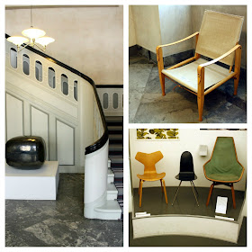
One of the best-known facts about Denmark is that it is a global leader in the area of game-changing industrial and applied design. Designmuseum Danmark prominently features the best of Danish design, as well as rotating exhibits from other times and places. At the time of our visit, mid-century modern architect and furniture designer Finn Juhl was the subject of a large exhibit.
Bungalow
Ravnsborggade 17
Like a moth to a flame, I'm drawn to any store that sells patterned and printed fabrics. Bungalow, Danish purveyor of fairly-priced block-printed fabrics, was on my itinerary after I discovered the company's aesthetic. Filled to the ceiling with vibrant pillows, dish cloths, tablecloths and boxes, this shop is bright and inviting. The prices were incredibly reasonable (think $40 for a pillow you won't be seeing in everyone's home) and the owner was sweet and very friendly. Needless to say, I may have taken home several pieces...
(all images via Meet Me in Philadelphia)

To contradict Shakespeare, nothing at all is rotten in the state of Denmark. 
In fact, it was pretty great all around.
Be back tomorrow for the wrap-up of my week-long trip recap!