All week I've been chattering about the living room like a little monkey. Well, enough of that. Today: it's all about the master bedroom. Let the post commence!
There comes a time when a "done" room needs to change, and that's how I feel about our master bedroom. With an abundance of light and space in our new room, I have the urge to go a little darker, moodier and a little more mature. Today, it's all about reimagining our master.
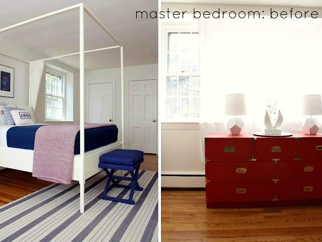
Here's what I'm working with:
Basically, the room stands just as it did when we lived in the city; but after a few years with the red, blue and white color scheme, I'm ready to replace it for some black, white, gray and a maybe a little rose. The larger room (our master is about 14' x 21') also invites a new chaise or loveseat and certainly matching nightstands that we couldn't have fit in our apartment.
Basically, the room stands just as it did when we lived in the city; but after a few years with the red, blue and white color scheme, I'm ready to replace it for some black, white, gray and a maybe a little rose. The larger room (our master is about 14' x 21') also invites a new chaise or loveseat and certainly matching nightstands that we couldn't have fit in our apartment.
I'd love to hang some kind of black and white landscape mural, blowing up an etching like this and applying it to the wall between the windows that at on either side of the bed:
The more grown-up direction also calls for new textiles. For one, I've decided to make billowy silk curtain panels with fabric from Gray Lines Linens after receiving this sample in ivory.
Picture something like these curtains from Lonny, except in ivory:
(via Belclaire House)
Anything is an improvement over what we have now: two curtain-less windows and one window that's half-covered with a sheet. Classy, I know.
When it comes to the bed, we'll keep our Ikea Edland for now because its lines are clean and simple, and I think it will prove to be versatile.
The new color scheme means the red and blue bedding will be retired. In their place, I like the idea of Dwell's "Ink Border" bedding and its exaggerated trim. To avoid a somber look, I'd like to add touches of rose here and there.
At this point, all of the ideas above are simply that: ideas. None have been realized. I'm hoping to slowly transition from a red-blue-white master bedroom to a black-white bedroom in the coming months. I'm not sure what I'll be doing with the 2 red campaign chests, striped rug or chevron chair, but maybe eventually I'll entertain notions of selling them and using the money to reinvest in investment pieces.
What do you think of these ideas?
I'm excited for a change like this, which just feels right for our new house.


.jpeg)


I think you are on a pretty killer track girlfriend. Love the plan!!! That mural and the colors, love. You've got such a great size room with such great light - I'm with you, go darker. :)
ReplyDeleteIf you ever make the move to sell the campaign pieces, I would be happy to take them off your hands!
ReplyDeleteI like your bedroom no, but I love your ideas! I think it'll be beautiful!
ReplyDeleteAshley, since I already have one of your campaign sell-offs, I'd be happy to buy its campaign family...if you decide to sell:)
ReplyDeleteLoooove. I have been recetly gravitating to a more neutral palette and I love it so far. Plus it allows for many options if you want to add pops of color.
ReplyDeleteChampagne Lifestyle on a Beer Budget
you're smart to make a plan--I have always gone mostly willy nilly in my own house. It generally works out, but it is a long and winding road.
ReplyDeleteLove the direction you're going!
Oh I love! So sophisticated, and very appropriate for your home. Spot on.
ReplyDelete