Hello, friends! Before I begin I wanted to thank you from the bottom of my heart for the tremendously positive comments on my den, which I revealed yesterday. Your feedback overwhelmed me, honestly. I constantly remind myself that I'm not an interior design professional. I just follow my eye and my heart...sometimes, it actually works out!
Since a number of you wanted to hear about specific items, I'll break down all of the details of the space today.
Let's start off with the "before" condition of the den when we bought our house in January:
Seating:
I knew I wanted an English roll-arm sofa for its classic but comfy shape. When I was researching the style, I discovered the Bluebell sofa from Sofa.com. Adam insisted we sit on it, so we visited their NYC showroom one weekend. Like that, he was sold. I can't say enough good things about our experience, the quality, the options. We ordered the three-seat Bluebell sofa in brushed linen.
The small parlor chair next to our pine chest is newly-upholstered in a cream linen. I bought it last year for $50 and it certainly didn't look chic back then. I toyed with the idea of a pattern on this chair, but decided that a solid linen was going to be more versatile.
Curious about the black bamboo chair next to our pine chest? Tomorrow I'll talk all about it.
Paint and fabrics:
As many of you know, dark blue is a popular one for paneled rooms these days. We opted for Benjamin Moore's "Gentleman's Gray" in a flat finish. Our paneled walls weren't in perfect shape, so we wanted to downplay any flaws in the wood. To appreciate the color, just look at the contrast between the new crown molding looks and new white ceiling:
The striped linen curtain panels were a labor of love from Mom, which I wrote about here. Smaller panels in the same fabric also cover the dutch door window.
I used several patterns for sofa pillows, including Ralph Lauren's "Azores" print for a matched pair.
Other decorative details:
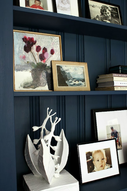
Most of the small decorative items in our den were collected over the past few years. Our built-in shelving is the prime spot for photographs of special people, books on our favorite artists and special pieces of art.
One such piece is our Aubrey Levinthal painting entitled "Flowers with Cups, 2013", which Adam surprised me with this year for our anniversary. You may remember I wrote about Aubrey's amazing talent in April.
The lily of the valley papier mache sculpture is by Stray Dog Designs was a wedding gift from my aunt and uncle. It always sits in a prime location wherever we've lived.
The pair of floor lamps flanking our sofa were purchased at CB2 in 2012. I spray painted them gold and haven't ever regretted that decision.
We also replaced the original fireplace screen with this spark guard from Woodland Direct.
I know some people are militantly against mounting a tv over a fireplace, but we were limited on where we could place the tv in this room. Remember the 70 gajillion doors I mentioned earlier? Adam found this slim-profile option from Crutchfield that keeps the tv from projecting too far from the wall. Note that the tv is centered over the hearth, not the mantle.
Hardware:
The final update worth mentioning: the new oil rubbed bronze door knobs and vintage-style cabinet latches added to the room. The dark knobs felt like a nice contrast to the blue walls.
Since a number of you wanted to hear about specific items, I'll break down all of the details of the space today.
Let's start off with the "before" condition of the den when we bought our house in January:
(our den "before")
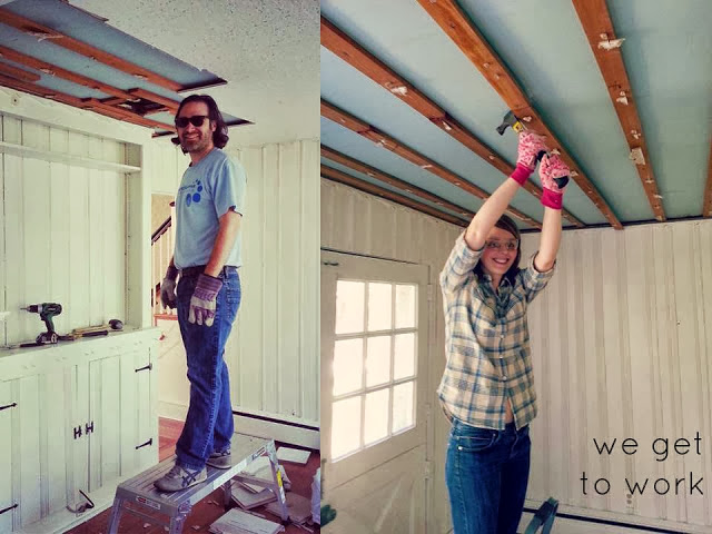
The paneling, wide plank flooring, cabinetry and dutch door were positives; the acoustical tile ceiling, dated hardware and 70 gajillion doors weren't. We got to work removing the tile ourselves, but hired professionals to skimcoat the ceiling and install crown molding.
My plan from way back in the winter looked a bit different than the den I revealed yesterday. The long and short of it is that plans change. Items I planned to use were discontinued or were one-of-a-kind and sold out. Boo, hiss...whatever. I got over it.
We forged ahead and began gathering furnishings for our den. Let's chat about them, shall we?Seating:
I knew I wanted an English roll-arm sofa for its classic but comfy shape. When I was researching the style, I discovered the Bluebell sofa from Sofa.com. Adam insisted we sit on it, so we visited their NYC showroom one weekend. Like that, he was sold. I can't say enough good things about our experience, the quality, the options. We ordered the three-seat Bluebell sofa in brushed linen.
The small parlor chair next to our pine chest is newly-upholstered in a cream linen. I bought it last year for $50 and it certainly didn't look chic back then. I toyed with the idea of a pattern on this chair, but decided that a solid linen was going to be more versatile.
(before the parlor chair was reupholstered)
Our large ottoman is one of my favorite pieces, but it didn't start off so pretty. It was a bargain from Overstock that we got for a song with credit card points. It was the right shape and size though! Now it's gorgeous in inexpensive navy ticking stripe.
(via Overstock.com)
In June I shared my estate sale find of a lifetime, this antique English pine dresser. I loved it then and I might just love it more today. I might want to be buried with it...or in it.Curious about the black bamboo chair next to our pine chest? Tomorrow I'll talk all about it.
Paint and fabrics:
As many of you know, dark blue is a popular one for paneled rooms these days. We opted for Benjamin Moore's "Gentleman's Gray" in a flat finish. Our paneled walls weren't in perfect shape, so we wanted to downplay any flaws in the wood. To appreciate the color, just look at the contrast between the new crown molding looks and new white ceiling:
The striped linen curtain panels were a labor of love from Mom, which I wrote about here. Smaller panels in the same fabric also cover the dutch door window.
I used several patterns for sofa pillows, including Ralph Lauren's "Azores" print for a matched pair.
Other decorative details:
Most of the small decorative items in our den were collected over the past few years. Our built-in shelving is the prime spot for photographs of special people, books on our favorite artists and special pieces of art.
One such piece is our Aubrey Levinthal painting entitled "Flowers with Cups, 2013", which Adam surprised me with this year for our anniversary. You may remember I wrote about Aubrey's amazing talent in April.
The lily of the valley papier mache sculpture is by Stray Dog Designs was a wedding gift from my aunt and uncle. It always sits in a prime location wherever we've lived.
The pair of floor lamps flanking our sofa were purchased at CB2 in 2012. I spray painted them gold and haven't ever regretted that decision.
We also replaced the original fireplace screen with this spark guard from Woodland Direct.
The mounted tv and our electronics:
We watch a good amount of tv/Netflix and Adam plays his Xbox in this room, but I didn't want to see any cords or equipment. Our built-in cabinet hides our cable box, router, etc., and the cords connecting our tv and cable box run into the cabinet.I know some people are militantly against mounting a tv over a fireplace, but we were limited on where we could place the tv in this room. Remember the 70 gajillion doors I mentioned earlier? Adam found this slim-profile option from Crutchfield that keeps the tv from projecting too far from the wall. Note that the tv is centered over the hearth, not the mantle.
Hardware:
The final update worth mentioning: the new oil rubbed bronze door knobs and vintage-style cabinet latches added to the room. The dark knobs felt like a nice contrast to the blue walls.
(all via Meet Me in Philadelphia)
Phew...did you read all that? There's no way you did...that's okay. I hope I covered all of the elements you, my sweet readers, wanted to know about. If I didn't though, please feel free to email me or comment with your question below!
Be back here tomorrow for the full details on the antique bamboo chairs I mentioned above!


It's amazing! Very inspired choices and they look wonderful. Question - what was the "berried" fabric on the original moodboard?
ReplyDeleteHi Erin--thanks so much!! The berry/stripe fabric on my original moodboard was actually one of the discontinued items I alluded to....ugh! It was a very affordable cotton utility fabric, like a ticking stripe, that I planned to use until I found out it was completely out of stock and discontinued. :(
ReplyDeleteGorgeous, gorgeous! Thanks for sharing your sources and your great finds
ReplyDeleteI did! (read it all that is) I love to know the what and the why, etc when people make design decisions. Also love how your look of this room evolved from your original board - nice to see how it transitioned. I'm sure you're enjoying all of the hard work you put into this room.
ReplyDeleteThanks Ashley. Bummer about that fabric but it still looks great!
ReplyDeleteWow thanks for the details!
ReplyDeleteThat Gentleman's gray is just so gorgeous!! I would even do a bedroom in that!! I think your choice to keep everything else light really drove the design right into the winners circle.. so well done!
ReplyDeleteBest,
Karolyn
I totally did read all of that. duh. i've said it before and i'll say (or type) it again - you are the details queen. i bow to you.
ReplyDeleteFabulous. I love the rich wall color with the light furniture. And the lamps. Wow!
ReplyDeleteSo beautiful. The wall color looks so luxe and totally tranforms the space. I adore it all. The pine against the dark walls?! The sofa, the gold lamp, the tv above the fp sans wiring! Love. Thanks for sharing the details, Ashley. I now officially hate my LR and want a do-over ;-)
ReplyDeleteAbsolutely gorgeous room - congrats! Quick question: where did you find the rope mirror? Thanks! :)
ReplyDeleteHi Rachel--I hope you see this reply! The mirror is the "Home Reflections Rope Mirror" from QVC of all places. I wanted a less expensive version of the Two's Company rope mirror and this alternative was only $50...now it's only $30!
DeleteThanks for the sources! Wondering if you went with the taupe on the sofa? I've heard the Great Bones, Good Pieces ladies singing sofa,com's praises too. I'm sold.
ReplyDeleteHi TEOT ladies! Yup, we went with the brushed linen fabric in taupe. It's, like, the perfect balance of taupe and very light gray. Couldn't be more pleased about it!
ReplyDeleteHI! I realize this post is really old so I hope you see this comment! Where is your rug from? It's so difficult to find a well-finished jute rug that is soft underfoot and not outrageously expensive. Thanks!
ReplyDeleteHi! What was the other fabric you used besides the Azore print from Ralph Lauren? Thanks!
ReplyDelete